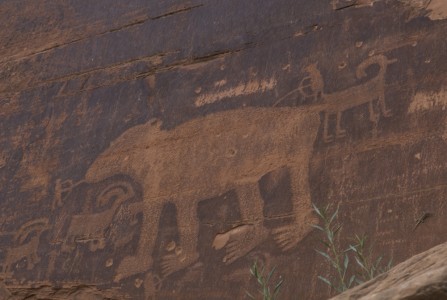
Petroglyphs are pictograms drawn by ancient cultures on the surface of rocks by incising, picking, carving, and abrading. Drawing is about mark making. Right now, I am looking at a rock that is on my shelf. It has particular marks incised on it. They were most likely created by natural causes-rubbing against another rock. Images, drawings and marks can become a part of a visual language for a designer. Particular types of images and marks become “personal petroglyphs” for me. The composition and spaces between the marks is what I find inspiring. Some of my personal petroglyphs are natural things like rocks, that I have traced or drawn. But others are cultural images found in media. I have a visual language book of images that I collect. Another box contains ephemera-printed material from the past. Petroglyphs can become constraints in a design process and relate specifically to a place. I like to hike and look for petroglyphs. This one was found along the highway somewhere near Moab.
fitness in design

In design, it is important to identify what determines fitness. In other words, how well does a project fit to the designer? Designers can be natural problem solvers within a particular project but how good are we at attracting the right mix of projects that reinforces our vision as the designer that we want to be? The difficulty lies with the skills that are associated with designers. Often there is more work out there than we have time to do. We can do many things, and well. So it is important to steer the boat to the right cove. It might require tacking against the current to find the right place. If we know ourselves, and communicate who we are or who we aspire to be to the right audience, then projects will be the right fit. Fashion and design is only in part about style it is about wearing something well. It is about fit. Even the fortune cookie agrees.
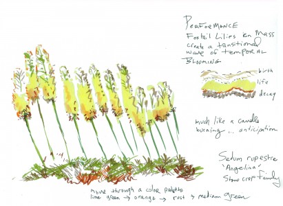
Foxtail Lilies
Thinking about the poetic transitional beauty of Foxtail Lilies. I had the opportunity to work around some of these at the Denver Botanic Gardens. I love the architectural beauty of their structure as they wave in the wind. In my mind, Sedum Rupestre “Angelina” is a perfect ground cover for underneath. In the fall, the colors in the sedum reflect the earlier transition of the Foxtail Lilies. And then the lilies sport wonderful podlike beads and remain architectural throughout the fall. I may plant some very soon in a contemporary space that I am designing.
“Finding” Design Value in Social Media
Social media sites that track the innovations in technology and practices are a fast-growing network. These sites can be described as ‘finders’ which can also describe the people hired to gather the actual content. They search intensely for inspiration by lurking around creative websites. Creatives are asked sign up and be a part of the design community. In exchange, designers gain connection to the never ending stream of inspirational images. Design creatives might not think about it but these sites watch and lurk. They harvest from the creatives they serve. I am torn about the value of these sites. Recently, I unliked one because an obscure image that I posted showed up for visual consumption on a design website that was my friend. Social media sites inform, connect but unless we are careful in our design processes, social media can play a role in the disservice of design thinking.
As I write this, I am thinking about how to responsibly use media technology in landscape architecture. The appropriateness is a big question in my mind. This morning, one of these websites inspired me to think about material possibilities in a different way. It triggered new thought and possibilites for a project. Searching for moisture sensitive light panels revealed the intense interest cultivated in the last 24 hours among the design harvesting websites. It is everywhere.
I might “like” the various design sites again, or not. I am not sure. In the future, I might think twice before posting a photo, link or something that might be better shared with design friends over drinks. To be aware is more important than to be guarded in design. Being overly guarded closes the door to the potentials of an interesting conversation.
Sequencers
A few days ago, an Algerian middle-distance runner was reinstated after being disqualified from the London Olympics for allegedly not trying hard enough in the 800-meter heats. It appeared to the public the runner didn’t run as hard as he could and interrupted the sequence of expectation. This athlete came to the Olympics and was slated to do well. People like to see effort and good competition, especially in the Olympics. This runner was expected to run a certain way. He was temporarily held accountable for the outcome of his performance. It turns out that he was favoring an injury and was only capable of running less than his best.
It seems to me that there is an expectation for social media to perform a certain way. People contribute content to social media and then expect it to behave a certain way. On some level as humans we feel when we speak, people should listen. We put out. We give and give and give. Humans need to be heard. And then, we want something worthy back. When that something doesn’t live up to our expectations, we are repulsed. We feel distanced from it. Social media brings us close and pushes us away.
Representing Landscapes of the Past
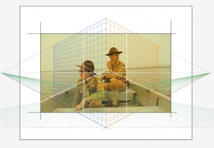
Last night, I went to the theatre to see “Moonrise Kingdom.” The story set in 1965, takes place on a New England island called “New Penzance.” The story unfolds after two young characters meet and become pen pals. Suzy runs away from home with her cat, lugging a collection of stolen books and a record player. Sam escapes from scout camp, prepared as a scout would be, to encounter the wilderness. They meet up in a meadow and then embark on a journey with the goal of reaching a secluded cove.
Primarily composed using a strong grid, the rule of thirds, the landscapes in this film depict a controlled, designed vision. Carefully placed characters graphically relate to the horizon line and the vanishing point. The cinematographer set the views almost entirely in one-point perspective, an effect similar to peering into a dollhouse. The camera must have been locked into two contraints. It appeared as if the camera movement was fixed to a rail, moving horizontally and vertically. One-point perspective communicates the feeling of containment in a box. It is a controlled vision of the elements selected for the box. Pieces of ephemera, gallery announcements, special cards and chinese fortunes get stashed away in boxes. The items stowed away in a box eventually become faded, iconic notions of the past. 
Tracking Loyalty
How do we track loyalty in our design selves? This morning, I woke up with the sun and headed to the grocery store. My local grocery store has responded to customers comments with a store re-design and fresher produce. Improved products are displayed in a warmer environment. The customer relationship has changed. People in the store are friendlier and seem more relaxed. This store went from an unpleasant experience to one that I actually enjoy. For a long time, I paid no attention to the reward system. It consisted of encouraging me to buy things that I cared little about. But today, I was rewarded with a free in-store gourmet coffee coupon. The store is tracking my loyalty. I have been tagged by an analyst to find out if this reward will influence my shopping pattern.
How can we track our loyalties in design? What systems and rewards can we set up in our practices that bring us back to our goals, objectives and design selves? This is a conversation that I am having with myself today.
Van Buren Point
Good friends recently reminded me of a trip that we took together to Van Buren Point-located in Lake Erie, New York. It is a place defined by the little summer bungalow cottages built in the 1920’s along the shore of a small bay created by an outcropping of rocks. I filled a sketchbook of paintings, lazily documenting our week long break. At times, I painted in a canoe and in the car-when we visited an amish community. The local store was Andy’s, where we could bike to buy fresh corn and whatever we needed. I am not sure if it is still in business, but it was a charming little store. Kenny on the couch reminds me that August can be a time to melt into the couch and escape with a book.
Judging the Sunset
Every night in the summer, I try to make time to watch the sunset. The Colorado sky is the perfect venue for seeing dramatic views of color, shape and form. Its ever-changing display eventually reveals a purity of color made possible by the lack of humidity. Juxtaposed against the subtle pinks and grays I see cobalt blues, red and amber oranges dancing in a dramatic display. On the east coast, the sky filled with humidity, has more grays. Viewing the landscape there is like looking through layers of transparent silk. The veils of silk visually knock back elements of the landscape, giving clues to how far away I am from my subject. In Colorado, as the sun sets low in the sky, the conversation ultimately goes to the evaluation of the sunset. I am troubled by the idea of rating a sunset. How can we decide upon the metric? How can something so spectacular be measured? And by what standard? To do this destroys the view. How can we put a number and value on nature? I have decided instead to find qualitative comparisons to the sunset. Right now, I am observing the relationship between what I see, and the qualities observed by landscape painters in history. Is this what Claude Lorrain would have seen in France in the mid 1600’s?
Aesthetic Ghosts
“Every man need aesthetic ghosts in order to live,” Yves Saint Laurent at his retirement in 2002.


