Representing Landscapes of the Past

Last night, I went to the theatre to see “Moonrise Kingdom.” The story set in 1965, takes place on a New England island called “New Penzance.” The story unfolds after two young characters meet and become pen pals. Suzy runs away from home with her cat, lugging a collection of stolen books and a record player. Sam escapes from scout camp, prepared as a scout would be, to encounter the wilderness. They meet up in a meadow and then embark on a journey with the goal of reaching a secluded cove.

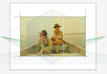
Primarily composed using a strong grid, the rule of thirds, the landscapes in this film depict a controlled, designed vision. Carefully placed characters graphically relate to the horizon line and the vanishing point. The cinematographer set the views almost entirely in one-point perspective, an effect similar to peering into a dollhouse. The camera must have been locked into two contraints. It appeared as if the camera movement was fixed to a rail, moving horizontally and vertically. One-point perspective communicates the feeling of containment in a box. It is a controlled vision of the elements selected for the box. Pieces of ephemera, gallery announcements, special cards and chinese fortunes get stashed away in boxes. The items stowed away in a box eventually become faded, iconic notions of the past.

Tracking Loyalty

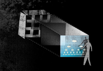
How do we track loyalty in our design selves? This morning, I woke up with the sun and headed to the grocery store. My local grocery store has responded to customers comments with a store re-design and fresher produce. Improved products are displayed in a warmer environment. The customer relationship has changed. People in the store are friendlier and seem more relaxed. This store went from an unpleasant experience to one that I actually enjoy. For a long time, I paid no attention to the reward system. It consisted of encouraging me to buy things that I cared little about. But today, I was rewarded with a free in-store gourmet coffee coupon. The store is tracking my loyalty. I have been tagged by an analyst to find out if this reward will influence my shopping pattern.

How can we track our loyalties in design? What systems and rewards can we set up in our practices that bring us back to our goals, objectives and design selves? This is a conversation that I am having with myself today.

japanese fences

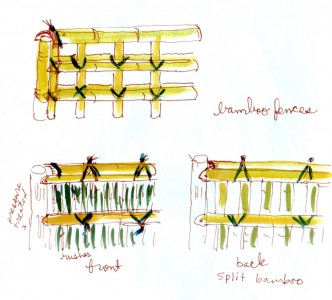
I need to invent a waterproof sketchbook. Recently while soaking in a Japanese hot tub, I contemplated the surrounding fence. It was a collage of at least ten japanese fence constructions. I felt the need to sketch and draw in the water. I noticed the proportions and how joints fit together in this fence. It is tempting to recreate designs. We see them here and want to put them there. My mind wandered. I have been warned about that but I can’t help it. If the mind wanders, let it do what it wants. What if the techniques inspired other forms of design? I went home and pulled out a sketchbook that I took with me to Japan years earlier. I remembered a quick color sketch that I did as I walked through Kyoto.  The photos from this trip are archived on my computer somewhere and the sketch is bound with the book, sitting on my shelf. Sketches and field notes are artifacts that float in the creative well, and easily accessed. Perhaps one day, this fence idea will become scalable and will inspire something unrelated to a fence.


Design Curation Environment

Gallery and museum directors were once the only curators. The idea of curation is changing and becoming public. Curation is no longer associated with a special person who carefully chooses art for galleries and museums. The word has become diluted and accessible to the public. Curation has come to include anyone who chooses images and then shows them to others.  In design, the constraints designers choose, and then how we respond is the definition of design.  “What is not there”  is  as powerful as “what is there.”

How I dress is an act of curation. What I choose to be in my house is an act of curation. These choices are a reflection of what I value.  Social media has forced us into being sorters of content and to think about curation. We decide what photos to upload and then if we choose to look, we are forced to see what others choose. Companies now hire visual image collectors to find and comment on utopian images. They are repackaged to a community or market; a collective design consciousness.  Streaming across my phone, I have seen that image just hours before. The images are perfect; where is the process associated with the design? I am not suggesting that designers walk around with blinders on or turn off the media to lock themselves in a library with a few select books. Although after looking at these words, this notion sounds rather wonderful. Maybe I could do this for a week or two. But in a matter of time, I would become antsy and look for a plug to reconnect and be a part of my culture again.

Designers must be must be careful to curate how images and content infiltrate their own design process environment. There are at least three important things to consider  with design curation. They are inter-related but have distinct meaning.

1. constraints-This involves deciding upon a few concise, elegant selection of ideas that doesn’t include everything in the kitchen sink.

2. editing- This is an active, yet flexible pursuit  that continually defines, clarifies and removes content.

3. discipline-Against the flexibility of editing there must be a honing of vision, a stick-to-it-ness that creates meaning and identity.

In the age of social media, designers must take the opportunity to think about constraints, editing and discipline.  In a sense, the designer is a fish, hovering between a few rocks, watching images and content float by. These rocks break the water and define the place in which the fish lives so others can know where he is situated. The fish is hovering between several stabilizing forces for a period of time. Some of the content floating past relates to the rocks. If the fish darts about between rocks, he is no longer situated in a place and his identity loses meaning. It takes discipline to pick a few rocks to hover against,  turning at times against the forces to have authority over the place.
Hyphenated-Design Experience

The idea of hyphenates is intriguing to me.  Today, I was researching water catchment solutions for a Tucson garden and reading a food and wine article. Perhaps I was hungry; my mind wandered between design, landscape and food. When things overlap, there is change, and the resulting conditions create opportunities for design thinking. People are rarely one thing.  Myself: illustrator-landscape architect, a title that I can easily hyphenate again and again. In my thesis, I researched theories from many fields and found interest in the space occupied by the hyphen itself. Even the ancient Incan technique referred to in Food and Wine Magazine article is a design idea with physical edges, terraces made to maximize water resources. Opportunities for design happens between at least two things.

http://www.foodandwine.com/articles/hollywood-canning-party-preservation-instinct