A city’s story is constructed much like DNA. Each DNA strand is unique and contributes particular notions regarding identity-a person or a place. New York Times writer, Fernanda Santos raises the question, “How do you continue to tell a city’s story if the remnants of its past have all come down?” It is possible to tell a story if the remnants of a city’s past have been removed. The removal of buildings is a edited story. It takes both a short view and long view of design. What stays and what is removed tells a story of “what is valued” now. Both the old and new tell a story about the experience of place. What is new today will be the old one day. Phoenix is in the process of a story burn-but is it a controlled burn? Are its historical roots being supported with the right kind of new growth and conditions? Design is not just a drawing on paper. It occurs subtly on many levels. People who take a stance on social policy and the workings of foundations are in a sense architects and builders. 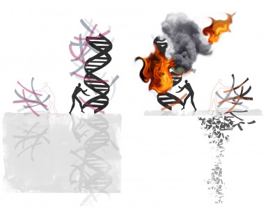
Landscape Legacy
As long products and services have existed, advertising media has been a part of the landscape. Apothecary shops selling salves and tonics extended the imagery to the outside of buildings. Here in Denver, traces of painted advertisements are faded reminders marking brick buildings. The companies that survived may have understood truth in advertising and the power of building brand legacy. Landscape architects who work with brands, have a unique challenge of understanding the brand, while serving the legacy of the landscape. Today, advertising is no longer a static concept confined to a mark on a building. It’s strength lies in the thoughtfulness of its social agency and a careful approach to the landscape. The brand and landscape are like two distinctive people. What parts of a brand are true to a place?
Core Beliefs
Flexibility is a good quality for a designer to have. A designer must be willing to crumble up the trace paper and start all over without regret. An open mind is flexible. However, a flexible designer is continually tested in practice. New ideas and suggestions should be auditioned. They are not always worthy of the part.
What is fitting for the experience of place or design? The designer must look to core beliefs and then find flexibility, to test the edge of their limits.
Core Beliefs:
1. State the problem.
2. Conduct primary research.
3. Observe people and the place in situ.
4. How do preferred design situations, factors, forces address the problem?
Robert Adams
Every once in a while an art review propels me into thought. Today, The New York Times referred to photographer Robert Adams as “a prophet in the wilderness of modernity.” His photos are often representations of the carcasses of industrial life. In the review, Ken Johnson described Adam’s use of form and metaphor as “economic and Shaker-like.”
It was the title, a reference to a requiem that really got me to slow down and read the review. A requiem is a musical celebration of a soul, not landscape, right? It is written and played to honor life in it’s final act. Not too long ago, I took in a room of Robert Adam’s photographs at the Denver Art Museum. Among other photographs, I remember an old Cottonwood tree. I saw them and walked away, only to be quickly drawn back. I wanted to take a second more contemplative read of how we see landscape. It is a reflection of ourselves.
personal petroglyphs
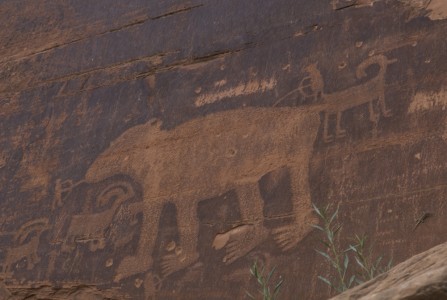
Petroglyphs are pictograms drawn by ancient cultures on the surface of rocks by incising, picking, carving, and abrading. Drawing is about mark making. Right now, I am looking at a rock that is on my shelf. It has particular marks incised on it. They were most likely created by natural causes-rubbing against another rock. Images, drawings and marks can become a part of a visual language for a designer. Particular types of images and marks become “personal petroglyphs” for me. The composition and spaces between the marks is what I find inspiring. Some of my personal petroglyphs are natural things like rocks, that I have traced or drawn. But others are cultural images found in media. I have a visual language book of images that I collect. Another box contains ephemera-printed material from the past. Petroglyphs can become constraints in a design process and relate specifically to a place. I like to hike and look for petroglyphs. This one was found along the highway somewhere near Moab.
Foxtail Lilies
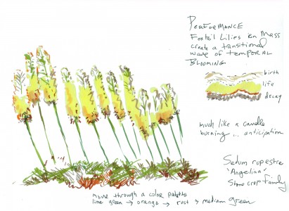
Thinking about the poetic transitional beauty of Foxtail Lilies. I had the opportunity to work around some of these at the Denver Botanic Gardens. I love the architectural beauty of their structure as they wave in the wind. In my mind, Sedum Rupestre “Angelina” is a perfect ground cover for underneath. In the fall, the colors in the sedum reflect the earlier transition of the Foxtail Lilies. And then the lilies sport wonderful podlike beads and remain architectural throughout the fall. I may plant some very soon in a contemporary space that I am designing.
“Finding” Design Value in Social Media
Social media sites that track the innovations in technology and practices are a fast-growing network. These sites can be described as ‘finders’ which can also describe the people hired to gather the actual content. They search intensely for inspiration by lurking around creative websites. Creatives are asked sign up and be a part of the design community. In exchange, designers gain connection to the never ending stream of inspirational images. Design creatives might not think about it but these sites watch and lurk. They harvest from the creatives they serve. I am torn about the value of these sites. Recently, I unliked one because an obscure image that I posted showed up for visual consumption on a design website that was my friend. Social media sites inform, connect but unless we are careful in our design processes, social media can play a role in the disservice of design thinking.
As I write this, I am thinking about how to responsibly use media technology in landscape architecture. The appropriateness is a big question in my mind. This morning, one of these websites inspired me to think about material possibilities in a different way. It triggered new thought and possibilites for a project. Searching for moisture sensitive light panels revealed the intense interest cultivated in the last 24 hours among the design harvesting websites. It is everywhere.
I might “like” the various design sites again, or not. I am not sure. In the future, I might think twice before posting a photo, link or something that might be better shared with design friends over drinks. To be aware is more important than to be guarded in design. Being overly guarded closes the door to the potentials of an interesting conversation.
Representing Landscapes of the Past
Last night, I went to the theatre to see “Moonrise Kingdom.” The story set in 1965, takes place on a New England island called “New Penzance.” The story unfolds after two young characters meet and become pen pals. Suzy runs away from home with her cat, lugging a collection of stolen books and a record player. Sam escapes from scout camp, prepared as a scout would be, to encounter the wilderness. They meet up in a meadow and then embark on a journey with the goal of reaching a secluded cove.
Primarily composed using a strong grid, the rule of thirds, the landscapes in this film depict a controlled, designed vision. Carefully placed characters graphically relate to the horizon line and the vanishing point. The cinematographer set the views almost entirely in one-point perspective, an effect similar to peering into a dollhouse. The camera must have been locked into two contraints. It appeared as if the camera movement was fixed to a rail, moving horizontally and vertically. One-point perspective communicates the feeling of containment in a box. It is a controlled vision of the elements selected for the box. Pieces of ephemera, gallery announcements, special cards and chinese fortunes get stashed away in boxes. The items stowed away in a box eventually become faded, iconic notions of the past. 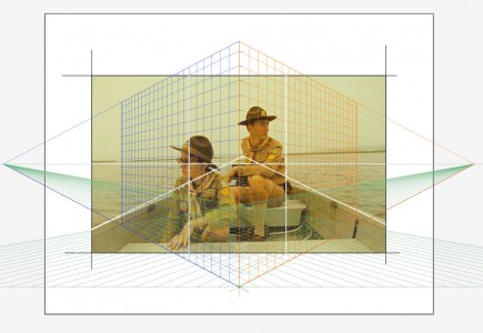
Van Buren Point
Good friends recently reminded me of a trip that we took together to Van Buren Point-located in Lake Erie, New York. It is a place defined by the little summer bungalow cottages built in the 1920’s along the shore of a small bay created by an outcropping of rocks. I filled a sketchbook of paintings, lazily documenting our week long break. At times, I painted in a canoe and in the car-when we visited an amish community. The local store was Andy’s, where we could bike to buy fresh corn and whatever we needed. I am not sure if it is still in business, but it was a charming little store. Kenny on the couch reminds me that August can be a time to melt into the couch and escape with a book.
Judging the Sunset
Every night in the summer, I try to make time to watch the sunset. The Colorado sky is the perfect venue for seeing dramatic views of color, shape and form. Its ever-changing display eventually reveals a purity of color made possible by the lack of humidity. Juxtaposed against the subtle pinks and grays I see cobalt blues, red and amber oranges dancing in a dramatic display. On the east coast, the sky filled with humidity, has more grays. Viewing the landscape there is like looking through layers of transparent silk. The veils of silk visually knock back elements of the landscape, giving clues to how far away I am from my subject. In Colorado, as the sun sets low in the sky, the conversation ultimately goes to the evaluation of the sunset. I am troubled by the idea of rating a sunset. How can we decide upon the metric? How can something so spectacular be measured? And by what standard? To do this destroys the view. How can we put a number and value on nature? I have decided instead to find qualitative comparisons to the sunset. Right now, I am observing the relationship between what I see, and the qualities observed by landscape painters in history. Is this what Claude Lorrain would have seen in France in the mid 1600’s?
